Problem
Peloton Technology’s focus on safety and efficiency in truck platooning was at the heart of the company identity. Still, there was a need to update its brand to reflect the spirit of innovation and company culture to attract engineering talent.
Solution & Impact
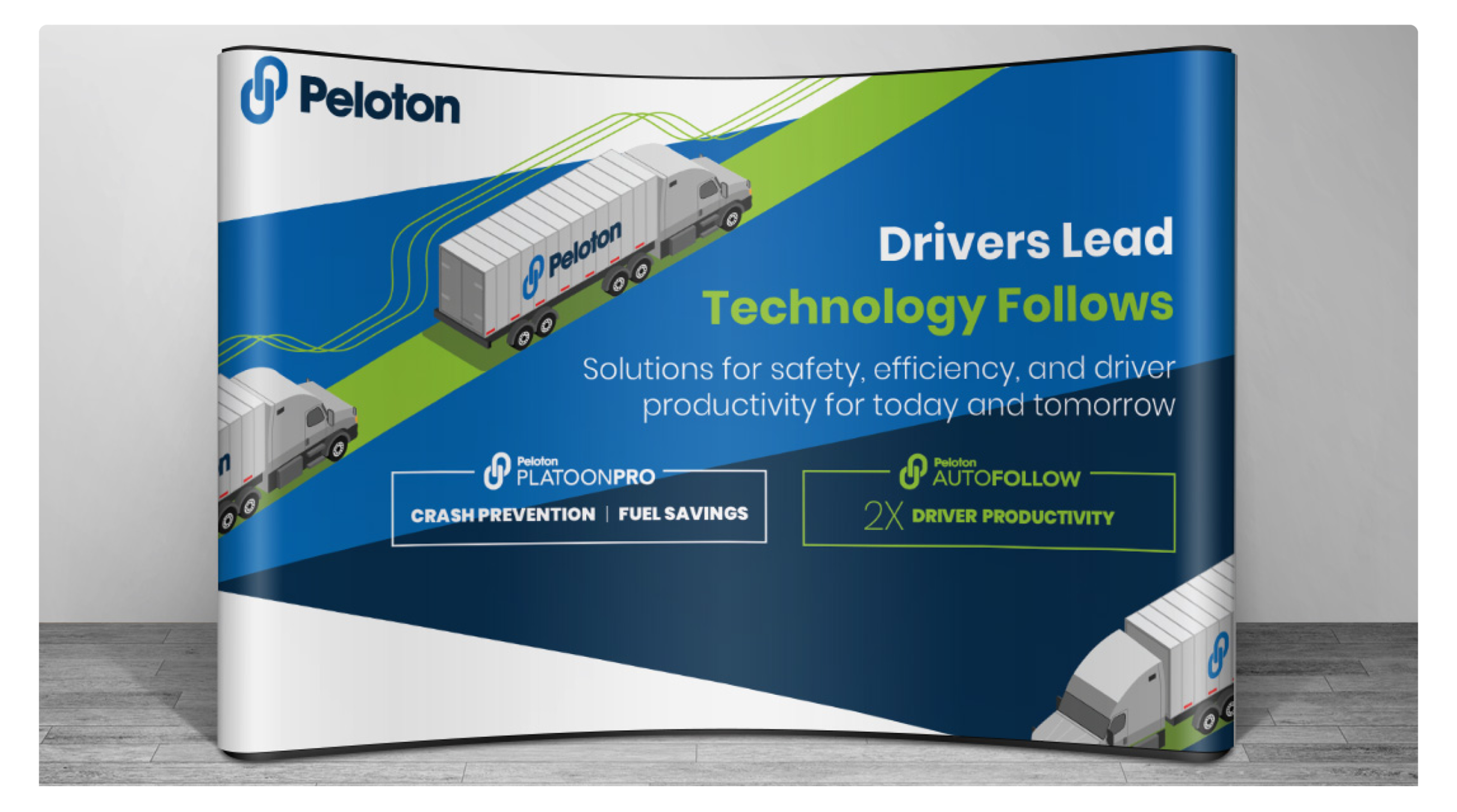
Working with Peloton’s team, BlueApple created a set of 3d illustrations, an updated color pallet, an icon library, and a style guide that helped bring life and visual interest to the website, PPTs, and marketing materials.
Our process
UX Map
Our process
Wireframes
Wireframes provided a clear overview of the page structure, layout, information architecture, user flow, functionality, and intended behaviors. They also provided Razorthink team with an easy way to communicate their feedback to us and move quickly through approval process
Our process
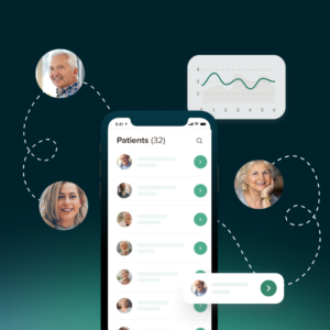
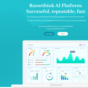
Website
Website design focus was on creating a clear and open space where complex technical information could be received without visual distraction. We created monotone visual theme with slight dimensional elements in the background to contrast with large white areas and minimal icons and graphics.
Our process
PPT
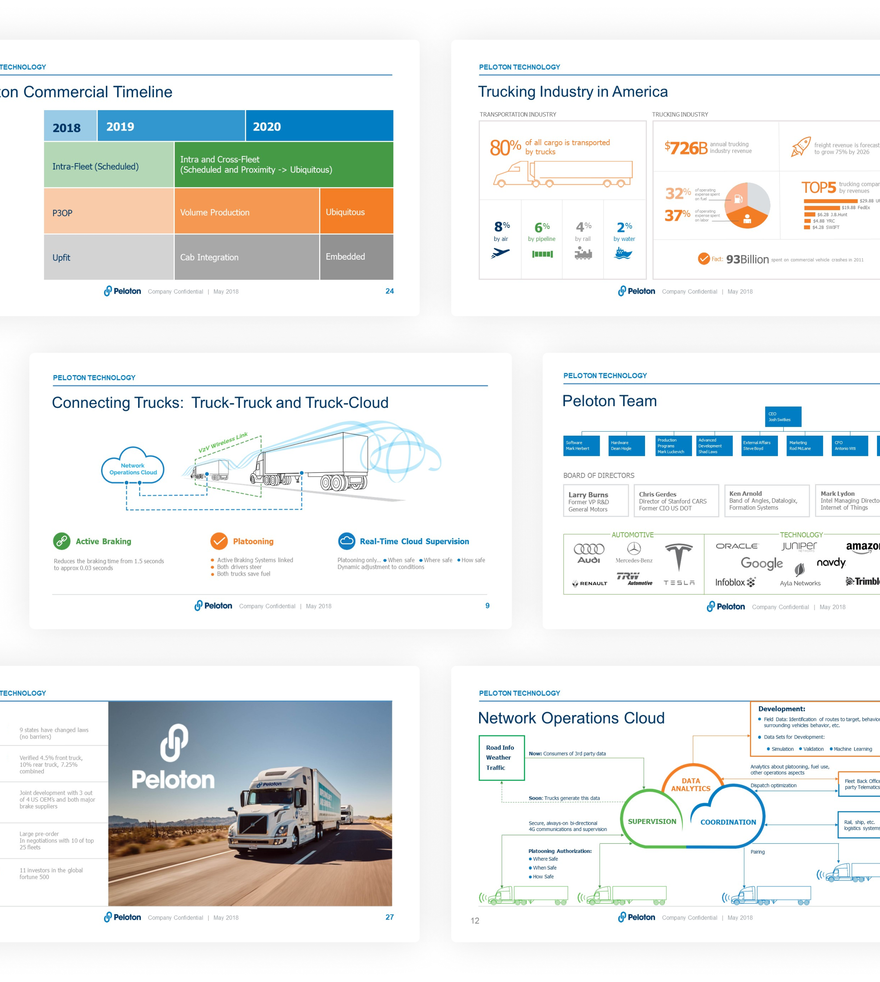
Presentations
PPT presentations range from investor and sales decks to presentations for events and product releases. Our goal is to ensure that information communicated in the slides is clear, easily digested, and consistent.